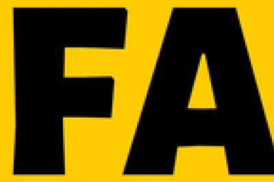
The easiest way to make your logo get spotted easily is to create a pop of contrast. The most attractive logos are the ones that have some kind of contrast in the design elements. If you are creating a logo design, you must pay attention to how to use contrast in your favor and create a unique and impressive logo.
How to Add Contrast to Your Custom Logo Design
Here are 10 ways to use contrast in logo design.
Contrast with Dark and Light Colors
Generating contrast using dark and light colors is one of the most common types of contrast being used. You need to make sure that the various elements in the custom logo design are either darker or lighter than the background.
You can experiment with lots of different colors than just sticking with black and white. Monochromatic logos are great but if there are too many details all the contrast is lost. You can find out easily if the colors of your logo are contrasting enough or not. For this, squint your eyes and if 2 colors almost become one blended shape then they are not contrasting enough.
Contrast with Color Hues Opposites
In the color wheel, contrasting colors are those which are directly across the wheel. You can use these contrasting colors to create a bold design that readily grabs the attention of your target audience. Complementary colors are violet/yellow, blue/orange, red/green.
For instance, in the Pepsi logo, bright red color is paired with a darker blue to create a pop of contrasting hues. This helps to grab the attention of the audience towards the logo. You can take the help of color psychology to choose colors that communicate with your audience.
Contrast with Shape
The most classic example of contrasting shapes is a circle and square. Other than this, ovals and triangles, straight lines, and wavy lines also create a good contrast. You can even use curve lines or straight lines of your font style to create a contrast with the shapes of your logo design.
Geometric shapes can be used contrastingly with organic shapes. For instance, the organic shape of any plant like cactus is contrasted with brighter and sharper shapes of triangle prickles. The prickles are larger and placed prominently to create better and more visible contrast with shapes.
Contrast with Saturation
Furthermore, you can add gray to one of the colors in your logo design to create a difference in color saturation. Saturation refers to the intensity of color in an image. When saturation is increased, the colors appear brighter. Great contrast can be created in the logo by using one heavily saturated color with a desaturated one.
For instance, two colors used in a logo are light gray-blue and dark blue. The former color is a desaturated one and is not quite eye-catching but when placed next to a heavily saturated one, it enhances the contrasting effect even more.
Contrast with Negative Space
Negative space is using white space within an image to create a new image creatively. It is an amazing way to create minimalistic and visually attractive designs. Next, it adds depth to the logo and also draws attention to desired logo elements.
For instance, a famous example of negative space usage in a logo is FedEx. In this company logo, the white space between the letter E and X is used cleverly to create an image of an arrow. It matches what the company does for business.
Negative space can be cleverly used to create more attractive and interesting logos. Whether you are creating an engineering logo or youtube logo, you can use this technique to add hidden meanings to a logo.
Contrast with Texture
Changing the texture of the logo design elements can help in the contrast between 2 colors or shapes in the logo. The human eye is designed to compare smooth surfaces to rough ones. You can create this kind of contrast in your logo by using smooth as well as rough textures.
You can try by using a smooth and clear font style with a rough style with little splatter texture. This will help to generate the necessary contrast in your custom logo design.
Contrast with Position and Orientation
You can add contrast to your logo, and change angles to make it different and unique. A famous example of such a logo is the Starbucks logo. It uses concepts with arching text around the circle creating a different approach.
You can play around with the position and orientation of your logo. For instance, Red Bull creates contrast with 2 bulls positioned like a mirror image. It increases interest in the logo and looks visually appealing.
Contrast with Font Combinations
Font style is one of the major elements of a logo design. You might want to pick a variety of different fonts that look eye-pleasing but using more than 2 fonts can make your logo look cluttered and complex. You can try picking 2 different font styles to achieve contrast in your logo design.
Usually, designers try to pick simple sans serif or serif fonts to improve readability. However, the contrast of a simple font style with a complex font style can help grab viewers' attention. Also, visual hierarchy can be used to arrange elements to point out the order of importance. It will also look more appreciable.
Contrast with Typography weight and Kerning
It is not necessary to pick dramatically different fonts to create a contrast. You can achieve a subtle contrast with heavier typography weight or change the space between letters (kerning).
For instance, the smaller word in your company logo can be used with higher typography weight and lesser spacing. The longer and less prominent words of the logo can be used in smaller font sizes and with more spacing.
Contrast with Scale and Size
You can also grab the attention of your potential customers by adding little details in larger shapes. Using contrasting sizes creates a hierarchy in design and leads proper attention to important parts of the logo.
In a logo design if you use the same font size and line weight for all the words, then it will be quite hard to make your audience even look at your logo. You can try bringing contrast with scale and size rather than choosing contrasting colors or heavier font styles.
Contrasting with scale and size can be done in various fields like farm logo, security logo, business logo, etc.