

To invest in stocks, one needs to understand the organizations in it. A stock represents a company. A company is made of products, services, books of accounts, assets, and much more. All these key pieces of information determine the fundamentals of the company. Stock exchanges have many such companies. People trade stocks in anticipation of making money.
While people invest in stocks in anticipation of making money, most of them are uninitiated on how the market works. It’s the same with anything new that we begin. It has a learning curve, but a longer one. Stocks are ruled by market forces which may not be in our control. Politics, geo-politics, industry slowdown, competitor news, climate change, and many such factors affect the way the price of stocks of individual companies react.
This is why being aware of the following helps:
- Public sentiments
- SGX Nitfy
- A particular stock financial situation
- Global news and current affairs
- Charts
- and your risk appetite and patience
Let’s discuss how to read and understand the charts of the stocks in the market:
I understand that reading and interpreting charts can seem overwhelming.
Let's start by understanding charts and how to read them. A chart is a graphical representation of a stock's price movement across a particular duration. The horizontal axis represents time (days, weeks, months, etc.), while the vertical axis represents price.
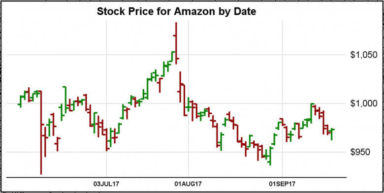
This graphical view has a component in the form of sticks. They are known as candlesticks. If you understand what they mean, reading the stock market may get easier. Each candlestick represents the price action for a specific time frame (e.g., one day). The structure of the candlestick represents the opening and closing prices, while the wicks (the thin lines above and below the body) represent the highest and lowest prices during that moment.
Here's a quick example: Consider a green candlestick on the stock you are considering investing in. The bottom structure of the candlestick represents the opening price, and the top of the structure represents the closing price. Since the closing price is higher than the opening price, the body is green, depicting a positive price movement. A red candlestick means the closing price was lower than the opening price. In such a scenario, it can indicate a bearish trend.
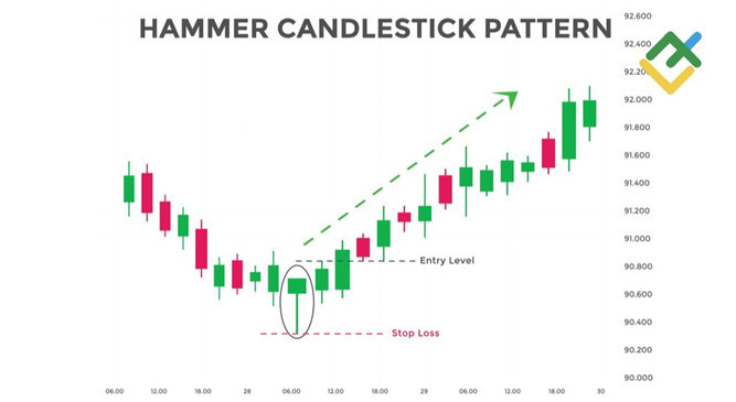
These candlestick patterns can provide intriguing insights into the market sentiment which helps with understanding the price movements. For instance, a "hammer" pattern (a small body with a long lower wick) can mean the reversal of a bull trend potentially, while a "shooting star" pattern (a small body with a long upper wick) may flash a bearish reversal of price.
Of course, chart reading alone will not make you a better trader. You'll also want to consider technical indicators, and fundamental analysis, to your trading strategy. Trading does involve a chance of luck. Playing it wisely will help you. Also, understand that not every trade of yours can be successful.
Consider talking to an expert or getting a book that you can use to help yourself.


